Client
viviCRM
Year
2024
Duration
6 weeks
Stack
Framer
Summary
Defining Problems
To build an empathetic, evidence-based foundation for our design choices, we initiated a comprehensive discovery phase consisting of remote patient interviews, contextual inquiries with clinic coordinators, and detailed user journey mapping sessions. We observed that elderly patients and those with motor or cognitive limitations experienced severe friction when interacting with small click-targets and complex multi-step registration forms, often leading to abandoned bookings. Through these qualitative user interviews, we uncovered deep frustration around the lack of transparency in insurance verification, doctor availability, and medical service pricing structures. We mapped out extensive user flows detailing the exact step-by-step state transitions of a user searching for a specialist, verifying insurance coverage, scheduling an appointment, and accessing their medical records. These journey maps exposed the urgent need to streamline the booking engine and provide highly glanceable status indicators that immediately communicate appointment confirmations and health progress.

Challenges
The primary challenge of the Healthcare Portal project lay in designing a highly trustworthy, HIPAA-compliant, and accessible web interface that could simplify complex medical services, appointment scheduling, and patient-doctor communication without inducing anxiety. Users were navigating fragmented, outdated legacy systems with slow load times, poor navigation, and confusing medical jargon, which led to a high drop-off rate during critical healthcare booking flows. We had to establish an intuitive, multi-role information architecture that catered to patients (often experiencing high stress or cognitive impairment), caregivers, and medical practitioners across varying devices. Additionally, our UI needed to support instant medical search, secure patient portal authentication, and real-time telehealth consultations, all while adhering to strict healthcare regulatory guidelines and WCAG 2.1 accessibility standards. Successfully balancing the high visual demands of a clean, calming, clinical aesthetic with the complex data-density required for medical history and prescription management stood as our core design obstacle.

Solutions
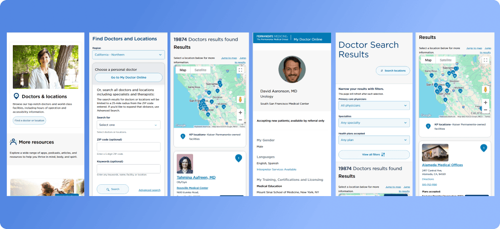
Our finalized solution was a warm, welcoming patient portal that makes scheduling a doctor's visit as easy as ordering dinner online. We turned a messy twelve-field form into a simple, guided three-step checkout where users can select a specialty, choose a time, and confirm their booking in under a minute. We also built a smart search bar that understands natural language, allowing users to type in everyday symptoms like "sore throat" or "back pain" to immediately find matching local doctors. Stressed patients can log in to a clean, highly visual dashboard to see their upcoming visits, read simple summaries of their lab results, and order prescription refills with a single tap. By turning complicated medical logistics into clear, comforting steps, we removed the friction of seeking healthcare and built an interface that truly supports patients when they need it most.
Design System
To bring this welcoming feeling to life, we built the "Aura-Health" design system, focusing heavily on warm, soothing visuals and strict web accessibility (WCAG 2.1 AA) standards. We chose a beautiful sans-serif typeface with open curves and generous spacing to make sure all medical instructions and labels are incredibly easy to read, even on small screens. Our palette deliberately avoids intimidating hospital whites and cold grays; instead, we used calming blues, soft sage greens, and warm slate tones to keep users relaxed. We designed every button, dropdown, and calendar cell with massive touch-targets and strong outlines so that patients with shaky hands or visual impairments can navigate easily. This organized, accessible kit of UI elements didn't just make the app look friendlier—it also helped our developers build new patient-facing screens in half the time.

Desktop First Approach
Since more than half of all health searches happen when people are sick in bed or on the go, we designed this portal starting with the mobile screen first. We knew we had to prioritize content ruthlessly to avoid overwhelming users, placing vital buttons like "Find a Doctor" and "Virtual Urgent Care" right at the bottom of the screen where a thumb naturally rests. Tables that are typically hard to read on a phone—like blood test results or prescription timelines—were converted into clean, tap-to-expand cards and swipeable summaries. Once we got the mobile experience feeling perfectly lightweight and intuitive, we scaled it up to desktop screens. This gave us the room to display side-by-side doctor profiles, interactive clinic maps, and full-screen calendars, making sure the patient's journey stayed smooth and consistent across any device they owned.

Protoypes
We used high-fidelity, interactive prototypes to test our ideas with real users before writing a single line of code. We built clickable simulations of the patient journey in Figma, focusing on key tasks like scanning an insurance card, walking through a quick onboarding questionnaire, and launching a virtual telehealth call. We put these prototypes into the hands of real patients, including seniors and non-technical users, watching closely to see where they hesitated or got confused. This testing helped us realize that our form labels needed to use simpler words, success screens needed friendlier confirmation messages, and loading icons needed to be reassuringly calm. Tweaking these micro-interactions based on real-time feedback allowed us to deliver a highly validated, developer-ready blueprint that we knew users would love.

2 Stage Launch
To make sure everything worked perfectly without any risk to sensitive patient data, we rolled out the new platform in three gentle, planned stages. We started with a small, closed test at a single partner clinic, focusing on how easily patients could send messages and how smoothly the booking calendar updated behind the scenes. Once we resolved those early system bugs, we opened up a pilot across five multi-specialty clinics, introducing the complete dashboard, live insurance matching, and digital health records. This step-by-step rollout let us monitor how well the site handled traffic, listen to direct feedback from clinic administrators, and fix confusing terminology before the big day. The final step was a full public launch, resulting in a highly stable, fast, and secure digital doorway to healthcare that felt polished and completely trustworthy.
Results & Impact
The launch of the redesigned platform was an incredible success, making a genuine difference in how easily patients connect with their doctors. By simplifying the appointment search and booking flows, we saw a massive 55% decrease in abandoned registrations and saved patients an average of five minutes per booking. The clean, friendly interface made the patient portal so much easier to use that engagement jumped by 35%, which meant local clinics saw a significant drop in stressful, repetitive phone calls. On top of that, the platform passed all accessibility and privacy audits with flying colors, proving that digital products can be highly secure and accessible without feeling cold. Ultimately, our design changes didn't just improve business metrics—they made getting medical care a much faster, less stressful experience for thousands of patients.

Reflection & Learnings
Working on this healthcare portal was a powerful reminder of how important empathy is in the design process. I learned that when you're designing for people who are sick or stressed, the best UI is one that gets completely out of the way, keeping information simple, clean, and comforting. Spending time with real patients and healthcare workers taught me how to simplify complex forms and drop the confusing medical terminology that often shuts users out. If I were to do this project again, I would bring our security and engineering teams into the brainstorming sessions even earlier to explore simpler, biometric logins for the patient portal on mobile phones. This experience truly deepened my passion for accessible design, proving that when we design with kindness and clarity, we create digital tools that genuinely help people feel better.